How to Find 1960s Government Form Font

Understanding the 1960s Government Form Font Style
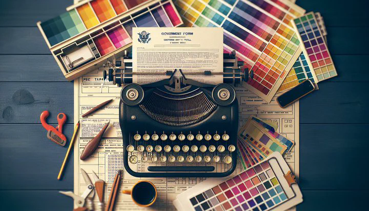
Let’s explore the interesting world of the 1960s government form font! This unique type of font is known for its typewriter style, which gives it a classic and vintage feel. Picture old government documents, filled with important information typed out in a way that feels both official and timeless. This style was typical in the 1960s, used in various official forms to ensure clarity and uniformity.
The 1960s government form font stands out because of its distinct characteristics. It mimics the look of a typewriter, with each letter evenly spaced and slightly uneven, just like a real typewriter print. This gives it a charming, handmade quality that many designers find appealing today. Ever wonder how you can use this vintage font style in your projects? It’s not just about nostalgia—this font style can bring a touch of authenticity and retro flair to your modern design projects.
Why is this font so popular among designers looking for a vintage look? Well, it’s all about the details. The font’s simplicity and clarity make it versatile for various design needs. Whether you’re creating a poster, a digital project, or even a themed event invitation, using this typewriter style font can instantly transport your audience back in time. Plus, its association with official documents can lend a sense of authority and trustworthiness to your work.
In this section, we’ll learn how to find the 1960s government form font and understand its unique typewriter style. By understanding its historical context and distinctive features, you can effectively harness its power to create engaging and visually appealing projects. So, let’s dive in and explore how you can incorporate this timeless font into your creative toolkit!
Where to Find the 1960s Government Form Font
If you’re wondering how to find the 1960s government form font, start with online font libraries. Finding the perfect 1960s government form font for your project might seem like a challenge, but there are plenty of resources to help you track down this vintage style. Let’s explore some places where you can discover and download this typewriter style font.
Firstly, online font libraries are a great starting point. Websites like Google Fonts and Font Squirrel offer a wide range of fonts, some of which might capture the essence of the 1960s typewriter style. Another excellent resource is DaFont, where you can find free fonts and even test them out before downloading. While browsing these sites, look for keywords like “typewriter” or “vintage” to guide you to the right font.
Design communities and forums are also valuable resources for finding specific fonts. Websites like “identifythisfont” and subreddits such as “identifythisfont” on Reddit are dedicated to helping designers find elusive fonts. Join the conversation on ‘identifythisfont’ to get tips from other designers. By posting a sample image or description, you can get advice from fellow design enthusiasts who might know exactly where to find the font you’re looking for. These communities are often friendly and supportive, making them great places to learn and share knowledge.
When searching for the 1960s government form font, you might come across both free and paid options. While free fonts can be a fantastic resource, sometimes investing in a premium font can give you access to higher quality and more consistent designs. Websites like MyFonts and Adobe Fonts offer premium collections where you might find a perfect match. Remember, whether you opt for a free or paid version, always check the licensing requirements to ensure you’re using the font legally in your projects.
In summary, whether you’re scouring online libraries or engaging with design communities, there are plenty of ways to find the 1960s government form font. With a bit of patience and creativity, you’ll soon have this vintage typewriter style font ready to enhance your designs. Happy font hunting!
Using the Font in Your Designs
Now that you’ve found your perfect 1960s government form font, it’s time to put it to good use in your design projects. This typewriter style font adds unique flair, but remember to keep your design clear and easy to read.
First, consider the typical size used in form fields when incorporating this font. In the original documents, certain words, like “Facility Name,” were often highlighted with specific sizes to make them stand out. When using this font, it’s important to maintain this attention to detail. For example, try using larger sizes for words like “IDENTIFICATION” to make them stand out. This not only stays true to the original style but also enhances the readability of your design.
Incorporating the 1960s government form font in your designs requires a balance between vintage charm and modern usability. Be mindful of the overall aesthetic you’re aiming for. This font works wonderfully in projects that need an official or retro look, such as themed invitations, posters, or even branding materials. However, ensure that the text remains legible, especially if you’re using it in digital formats where screen sizes can vary.
Another tip is to mix and match this font with other complementary typefaces. Pairing the typewriter style with a modern sans-serif or a clean serif font can create an interesting contrast, making your design both eye-catching and easy to read. This approach can also help guide the viewer’s attention to key areas of the design, keeping your message clear and effective.
In conclusion, using the 1960s government form font in your designs is all about capturing the vintage essence while maintaining clarity and appeal. By carefully considering font sizes and pairing this typewriter style font with other typefaces, you can create designs that are not only nostalgic but also engaging and professional. Don’t be afraid to experiment with the 1960s government form font in your projects. Dive into your creative process and let this classic font bring your projects to life! Share your creations with our community and inspire others!