How to Make a Visual Identity for a Fictive Client
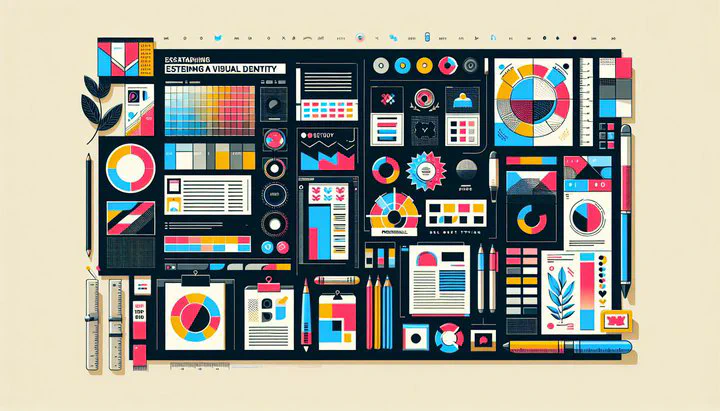
Introduction to Visual Identity
A visual identity gives your brand a unique face and personality. It’s the first thing people notice and remember about a brand. For a fictive client like Urba Maté, a healthy biological canned drink, having a strong visual identity is crucial. It helps set the brand apart from competitors and creates a connection with the target audience. Whether you’re working for a large company or a small startup, a well-thought-out visual identity can make all the difference. What first comes to mind when you think of a brand like Urba Maté?
So, what exactly is a visual identity? It’s a combination of the logo, colors, typography, imagery, and overall design style that represents a brand. For Urba Maté, the visual identity should reflect its values of health and sustainability. This means using elements that convey freshness, vitality, and an eco-friendly approach. A strong visual identity not only attracts customers but also communicates the brand’s message clearly and effectively.
When you make a visual identity for a fictive client like Urba Maté, it’s important to think about how to differentiate it from other brands. The visual identity should resonate with people who are looking for healthy and sustainable options. This involves understanding Urba Maté’s market position and target audience. By doing so, you can design a visual identity that is not only appealing but also meaningful. As you embark on this creative process, remember that the goal is to make it more unique and fit within the brand’s values.
Designing the Logo and Can Packaging
Creating the logo and the can packaging for Urba Maté is a key step in building its visual identity. The logo serves as the face of the brand, while the can packaging is what customers will hold in their hands. Both elements need to work together to reflect the brand’s values and stand out on the shelf.
To start designing the logo for Urba Maté, think about what makes this healthy biological canned drink special. The logo should capture the essence of freshness and health. Consider using natural elements like leaves, water droplets, or vibrant fruits in the design. Step 1: Sketch initial logo ideas. Step 2: Choose a color palette that represents health. Greens and blues are great choices to represent health and sustainability.
When it comes to the can packaging, the goal is to create something that catches the eye and communicates the brand’s message instantly. Use bold, clean typography that is easy to read. The imagery should align with the brand’s values, perhaps showcasing ingredients or nature scenes. Remember, the can is your canvas, so make it more unique and fit within the brand’s values of being eco-friendly and healthy.
Finally, ensure that the logo and can packaging work harmoniously together. They should tell the same story and convey the same emotions. It’s also important to consider practical aspects, such as how the design will look in different lighting or on various materials. By focusing on these details, you can create a logo and packaging that not only looks great but also connects with the audience on a deeper level.
Establishing Brand Guidelines and Homepage
Once you’ve designed the logo and the can packaging for Urba Maté, it’s time to establish brand guidelines and create a homepage. These are essential steps to ensure consistency and clarity across all brand touchpoints. Brand guidelines are like a rulebook for how the brand should look and feel, ensuring that everyone involved in creating content for Urba Maté is on the same page.
Start by outlining the key elements of Urba Maté’s brand guidelines:
- Logo Usage: Specific instructions on logo usage, such as minimum size and spacing, and how not to alter the logo.
- Color Palette: Choose colors that reinforce the brand’s identity as a healthy biological canned drink. Include details about the primary and secondary colors and how they should be used in different contexts.
- Typography: Select fonts that complement the logo and are easy to read.
- Imagery Guidelines: Decide on the types of images that best represent Urba Maté’s values and mission.
Designing a homepage that aligns with the brand guidelines is critical. The homepage is often the first interaction users have with Urba Maté online, so it needs to be engaging and informative. Use the brand’s color palette and typography to keep things consistent. The homepage should clearly communicate what Urba Maté stands for, highlighting the product’s benefits and unique selling points. Consider adding visuals that reflect natural and healthy elements, consistent with the brand’s image.
Consistency is key in maintaining a strong visual identity. By ensuring that all elements, from the logo to the homepage, adhere to the established brand guidelines, Urba Maté can present a cohesive and professional image. This not only makes the brand more recognizable but also helps build trust with the audience. As you work on these elements, remember that the goal is to make it more unique and fit within the brand’s values, creating a seamless and authentic brand experience.
Ensuring Brand Values Are Reflected
Creating a visual identity for a fictive client like Urba Maté requires more than just making things look good. It’s about making sure that every design choice reflects the brand’s core values. For Urba Maté, being a healthy biological canned drink, these values are health, sustainability, and natural goodness. How do your design choices reflect your brand’s core values?
First, think of the materials and imagery you use. If sustainability is a key value, choose materials for packaging that are recyclable or biodegradable. This not only supports the brand’s eco-friendly stance but also appeals to environmentally conscious consumers. When selecting images, opt for those that depict nature, like lush greens and clear waters. This helps convey a sense of purity and freshness, aligning with the brand’s emphasis on health.
Typography and color choices can also speak volumes about Urba Maté’s values. Use clean, simple fonts that are easy to read, suggesting transparency and honesty. Colors like green and blue are often associated with nature and wellness. These choices should feel organic and vibrant, mirroring the natural ingredients in Urba Maté. By paying attention to these details, you ensure that the brand’s values are communicated effectively.
Next, consider how to make the visual identity resonate emotionally with the audience. Ask yourself: How do these design elements make people feel? Do they inspire trust and confidence in the brand’s commitment to health and sustainability? Encourage feedback and be willing to make adjustments. Sometimes small changes, like tweaking a color shade or refining a logo element, can make a big difference in how the brand’s values are perceived.
Finally, remember that reflecting brand values is an ongoing process. As trends and consumer expectations change, so too may the need to evolve the visual identity. Keep assessing the designs to ensure they remain true to Urba Maté’s mission. By doing this, you not only create a strong visual identity but also build a meaningful connection with the audience, making the brand more unique and fit within its values.
Conclusion and Final Tips
As we wrap up our journey on how to make a visual identity for a fictive client like Urba Maté, it’s important to remember the key takeaways. Building a cohesive and memorable visual identity starts with understanding the brand’s core values and its unique market position. For Urba Maté, the focus on being a healthy biological canned drink guides all design decisions, from the logo to the can packaging and beyond.
When developing a visual identity, ensure that all elements work together seamlessly. The logo and the can packaging should communicate the brand’s message at a glance, while the brand guidelines maintain consistency and clarity across all platforms. Every piece of the identity puzzle should contribute to making the brand more unique and fit within its values.
Here are some final actionable tips for creating a successful visual identity:
- Research and Inspiration: Before you start designing, gather inspiration from other successful brands. Look at how they use visual elements to tell their story and connect with their audience.
- Experiment and Iterate: Design is an iterative process. Don’t be afraid to experiment with different styles and ideas. Sometimes the best solutions come from unexpected places.
- Seek Feedback: Share your designs with peers or the DesignResolve community. Constructive feedback can provide new insights and help refine your work.
- Stay True to Values: Always align your design choices with the brand’s core values. Whether it’s through color, typography, or imagery, these elements should consistently reflect what the brand stands for.
- Evolve with Time: Keep an eye on industry trends and be ready to adapt. A brand’s visual identity should grow and evolve, just like the brand itself.
By following these tips and maintaining a clear focus on the brand’s values, you can create a visual identity that not only stands out but also resonates deeply with the target audience. Remember, the goal is to inspire and connect, making your fictive client’s brand memorable and impactful. Share your visual identity projects with the DesignResolve community for feedback and join discussions for ongoing support and inspiration.