Perfect Handwritten Font Identification
Understanding Perfect Handwritten Fonts
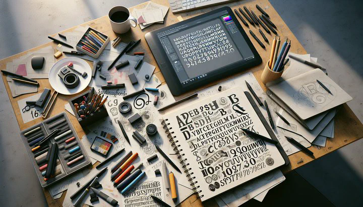
Have you ever seen a font so flawless, it seemed like it was written by a well-practiced hand? Today, we’re diving into perfect handwritten font identification. These fonts mimic natural handwriting with an almost too perfect look. But what makes them stand out?
A perfect handwritten font strikes a balance between authenticity and perfection. It captures the organic quirks of real handwriting, like varied letter heights and slanted lines, while maintaining consistency. This makes the font appear authentic, like a well-practiced signature. Yet, it’s not messy or chaotic. The letters are smooth and uniform, giving off a strong handwritten feel that’s both natural and polished. Balance is key in maintaining both the charm and readability of a handwritten style.
Some fonts achieve this balance better than others. For example, fonts like “Pacifico” and “Dancing Script” are popular choices. “Pacifico” has a smooth, flowing style, while “Dancing Script” offers a playful, rhythmic movement. These fonts embody the qualities of being both authentic and perfect.
When identifying a perfect handwritten font, look for characteristics like consistent stroke width and well-spaced letters. The letters should have a natural slant, but not so much that it disrupts readability. It should feel just right—crafted yet casual, like something you’d see on a handwritten grocery store sign. By understanding these traits, you can easily spot fonts that achieve that delicate balance of being almost too perfect yet beautifully handwritten.
Applications in Design
When it comes to adding a personal touch to your designs, perfect handwritten fonts can be incredibly useful. These fonts are often used in creating signage that needs to feel welcoming and informal, like a handwritten grocery store sign. By using these fonts, your signs can stand out, attracting attention while still being easy to read.
A handwritten grocery store sign typically benefits from a font that has a strong handwritten feel. This means the letters flow smoothly together, with just the right amount of variation to look natural yet polished. When you walk past a store with these signs, the inviting look can make you feel like you’re in a friendly neighborhood shop, even if it’s part of a larger chain.
These fonts are effective because they draw attention while remaining legible, making them ideal for signs that aim to convey warmth and friendliness. Beyond grocery stores, these fonts are also popular in other design contexts. Think about thank you cards, wedding invitations, or even branding for cafes and boutiques. A font that seems almost too perfect can add a touch of elegance and personality, making the design memorable and engaging. It connects with the viewer on a more personal level, which is exactly what you want for intimate or special occasions.
Using a perfect handwritten font can enhance the overall feel of your project. It provides a sense of warmth and creativity, which can be especially effective in designs that aim to convey a personal story or brand identity. By choosing the right font, you can ensure your design not only looks good but also communicates the right message.
Choosing the Right Handwritten Font
Selecting the perfect handwritten font for your project can feel like a big decision. You want your design to capture that strong handwritten feel while looking like it was written by a well-practiced hand. Here are some tips to help you make the right choice.
First, think about the overall style and mood you want your design to convey. Do you need something playful and fun, or are you aiming for a more elegant and sophisticated look? The context of your project will guide you in choosing a font that matches your aesthetic goals. For example, a handwritten grocery store sign might benefit from a friendly and approachable font, while a wedding invitation might call for something more refined.
Next, take the time to test and compare different fonts. Look at how each font handles the spacing between letters and the consistency of stroke widths. You want a font that feels natural but not messy. It should have an almost too perfect appearance, giving the impression of careful handwriting without sacrificing readability. Try printing your chosen font or using it in a digital mock-up to see how it appears in real-world applications.
Don’t forget to consider the font’s versatility. A good perfect handwritten font should work well in various sizes and formats. Try it out on different backgrounds and see how it looks in both large and small text. This will help ensure that your design remains clear and attractive, no matter where or how it’s used.
Finally, trust your instincts. Your personal connection to the font can be a great indicator of its suitability for your project. Sometimes, the best way to find the right font is to see which one speaks to you. If a font feels right for your project and achieves the desired look, it’s likely a good fit. By keeping these tips in mind, you can confidently choose a font that enhances your design and communicates your message effectively.
Experimenting with different fonts can lead to exciting design discoveries. Trust your creative instincts, and have fun exploring the world of perfect handwritten fonts.